
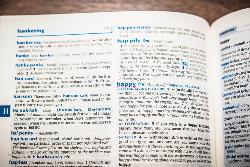
画像を使わずにCSSで蛍光ペン風マーカー線を引く
カラーコードは16進数(#FF0000など)で指定することが多いいですが、最近では、CSSを使って背景は透過はしたいけど、上に乗っているテキストはそのままで。。。というシーンが多くなってきたと思います。
CSS3からはRGBaのRed、Green、Blueと、そこにAlphaという透過度を使って半透明の表現ができるようになりました。
そこで、今回は文章中で強調したいテキスト部分に、蛍光ペンでマーカーを引いたような表現をしたい。
そんな時に使えるサンプルをRGBaを使って紹介します。
View
テキストが入ります。この部分に赤色の細いマーカーを引きます。
改行してもマーカーは続きます。テキストが入ります。テキストが入ります。
赤色の太いマーカー 青色の細いマーカー 緑色の細いマーカー 黄色の太いマーカー
Source
HTML
<p>テキストが入ります。<strong class="marker red thin">この部分に赤色の細いマーカーを引きます。<br>
改行してもマーカーは続きます。</strong>テキストが入ります。テキストが入ります。</p>
<hr>
<p>
<strong class="marker red fat">赤色の太いマーカー</strong>
<strong class="marker blue thin">青色の細いマーカー</strong>
<strong class="marker green thin">緑色の細いマーカー</strong>
<strong class="marker yellow fat">黄色の太いマーカー</strong>
</p>
CSS
.marker {
    line-height: 1;
    font-weight: normal;
}
.marker.red.thin {
    background: -moz-linear-gradient(top, rgba(255, 0, 0, 0) 60%, rgba(255, 0, 0, 0.4) 60%, rgba(255, 0, 0, 0.4) 100%);
    background: -webkit-linear-gradient(top, rgba(255, 0, 0, 0) 60%, rgba(255, 0, 0, 0.4) 60%, rgba(255, 0, 0, 0.4) 100%);
    background: linear-gradient(to bottom, rgba(255, 0, 0, 0) 60%, rgba(255, 0, 0, 0.4) 60%, rgba(255, 0, 0, 0.4) 100%);
}
.marker.red.fat {
    background: -moz-linear-gradient(top, rgba(255, 0, 0, 0) 0%, rgba(255, 0, 0, 0.4) 0%, rgba(255, 0, 0, 0.4) 100%);
    background: -webkit-linear-gradient(top, rgba(255, 0, 0, 0) 0%, rgba(255, 0, 0, 0.4) 0%, rgba(255, 0, 0, 0.4) 100%);
    background: linear-gradient(to bottom, rgba(255, 0, 0, 0) 0%, rgba(255, 0, 0, 0.4) 0%, rgba(255, 0, 0, 0.4) 100%);
}
.marker.green.thin {
    background: -moz-linear-gradient(top, rgba(0, 255, 0, 0) 60%, rgba(0, 255, 0, 0.4) 60%, rgba(0, 255, 0, 0.4) 100%);
    background: -webkit-linear-gradient(top, rgba(0, 255, 0, 0) 60%, rgba(0, 255, 0, 0.4) 60%, rgba(0, 255, 0, 0.4) 100%);
    background: linear-gradient(to bottom, rgba(0, 255, 0, 0) 60%, rgba(0, 255, 0, 0.4) 60%, rgba(0, 255, 0, 0.4) 100%);
}
.marker.green.fat {
    background: -moz-linear-gradient(top, rgba(0, 255, 0, 0) 0%, rgba(0, 255, 0, 0.4) 0%, rgba(0, 255, 0, 0.4) 100%);
    background: -webkit-linear-gradient(top, rgba(0, 255, 0, 0) 0%, rgba(0, 255, 0, 0.4) 0%, rgba(0, 255, 0, 0.4) 100%);
    background: linear-gradient(to bottom, rgba(0, 255, 0, 0) 0%, rgba(0, 255, 0, 0.4) 0%, rgba(0, 255, 0, 0.4) 100%);
}
.marker.blue.thin {
    background: -moz-linear-gradient(top, rgba(0, 0, 255, 0) 60%, rgba(0, 0, 255, 0.4) 60%, rgba(0, 0, 255, 0.4) 100%);
    background: -webkit-linear-gradient(top, rgba(0, 0, 255, 0) 60%, rgba(0, 0, 255, 0.4) 60%, rgba(0, 0, 255, 0.4) 100%);
    background: linear-gradient(to bottom, rgba(0, 0, 255, 0) 60%, rgba(0, 0, 255, 0.4) 60%, rgba(0, 0, 255, 0.4) 100%);
}
.marker.blue.fat {
    background: -moz-linear-gradient(top, rgba(0, 0, 255, 0) 0%, rgba(0, 0, 255, 0.4) 0%, rgba(0, 0, 255, 0.4) 100%);
    background: -webkit-linear-gradient(top, rgba(0, 0, 255, 0) 0%, rgba(0, 0, 255, 0.4) 0%, rgba(0, 0, 255, 0.4) 100%);
    background: linear-gradient(to bottom, rgba(0, 0, 255, 0) 0%, rgba(0, 0, 255, 0.4) 0%, rgba(0, 0, 255, 0.4) 100%);
}
.marker.yellow.thin {
    background: -moz-linear-gradient(top, rgba(255, 255, 0, 0) 60%, rgba(255, 255, 0, 0.4) 60%, rgba(255, 255, 0, 0.4) 100%);
    background: -webkit-linear-gradient(top, rgba(255, 255, 0, 0) 60%, rgba(255, 255, 0, 0.4) 60%, rgba(255, 255, 0, 0.4) 100%);
    background: linear-gradient(to bottom, rgba(255, 255, 0, 0) 60%, rgba(255, 255, 0, 0.4) 60%, rgba(255, 255, 0, 0.4) 100%);
}
.marker.yellow.fat {
    background: -moz-linear-gradient(top, rgba(255, 255, 0, 0) 0%, rgba(255, 255, 0, 0.4) 0%, rgba(255, 255, 0, 0.4) 100%);
    background: -webkit-linear-gradient(top, rgba(255, 255, 0, 0) 0%, rgba(255, 255, 0, 0.4) 0%, rgba(255, 255, 0, 0.4) 100%);
    background: linear-gradient(to bottom, rgba(255, 255, 0, 0) 0%, rgba(255, 255, 0, 0.4) 0%, rgba(255, 255, 0, 0.4) 100%);
}
SCSS
@mixin markerStyle($color0,$color1,$weight) {
    background: -moz-linear-gradient(top, $color0 $weight, $color1 $weight, $color1 100%);
    background: -webkit-linear-gradient(top, $color0 $weight, $color1 $weight, $color1 100%);
    background: linear-gradient(to bottom, $color0 $weight, $color1 $weight, $color1 100%);
}
.marker {
    line-height:1;
    font-weight:normal;
    &.red{
        &.thin {@include markerStyle(rgba(255,0,0,0),rgba(255,0,0,0.4),60%);}
        &.fat  {@include markerStyle(rgba(255,0,0,0),rgba(255,0,0,0.4),0%);}
    }
    &.green{
        &.thin {@include markerStyle(rgba(0,255,0,0),rgba(0,255,0,0.4),60%);}
        &.fat  {@include markerStyle(rgba(0,255,0,0),rgba(0,255,0,0.4),0%);}
    }
    &.blue{
        &.thin {@include markerStyle(rgba(0,0,255,0),rgba(0,0,255,0.4),60%);}
        &.fat  {@include markerStyle(rgba(0,0,255,0),rgba(0,0,255,0.4),0%);}
    }
    &.yellow{
        &.thin {@include markerStyle(rgba(255,255,0,0),rgba(255,255,0,0.4),60%);}
        &.fat  {@include markerStyle(rgba(255,255,0,0),rgba(255,255,0,0.4),0%);}
    }
}